Beverly Shipko, Artist
  • Paintings
    • Bakery Displays
    • Cakes, Pies & Tarts
    • Vending
    • Cookies, Cupcakes & Ice Cream
    • Additional Desserts
    • Egg-centric
  • Drawings & Prints
  • Art Exhibits
    • Solo
    • Group
    • Photos
  • About the Artist
    • Statement
    • Resume
    • Instagram
    • LinkedIn
  •  Blog
  • Daily Paintings Challenge
    • January 2015
    • September 2015
    • January 2017
  • Contact

Attractions

Keith Haring: Is his art really for everybody?

August 31, 2023 by Beverly

Recently I had the good fortune to be in Los Angeles and see the Keith Haring show, which had caught my eye on a list of 12 Must See Art Show in artnet news.

Exceeded Expectations

Art is for Everybody is an appropriate name for a show with such a breadth and diversity of medium and subject matter. This show is provocative, stimulating, and fun. Most of all it’s accessible, which was Haring’s oft proclaimed intention. It feels very timely even though much of this work was done in the 70s and 80s (1968-1990). And Haring only lived to age 31.

Bottom line: It exceeded my expectations. That’s what I want you to take away from this blog. The Keith Haring exhibit at The Broad, a contemporary museum in downtown Los Angeles, CA runs thru October 8, 2023. Read on for the details (and there are many! Hopefully not too many…).

I wasn’t the only one who felt this way. You can see Bonnie enjoying herself below. This was one show where I didn’t have to ask anyone to interact with the paintings – it just happened spontaneously! Haring’s love of dancing and music comes through in his work and is contagious.

But is Keith Haring’s art really for everyone? Or is it more accurate to say it’s accessible to everyone?

Certainly it’s simplified bold strokes and colors, dancing figures and barking dogs won’t appeal to everyone, especially art fans primarily drawn to traditional chiaroscuro paintings. While it’s not intended to be highbrow, it’s energetic shapes, bright colors, and diversity of subjects tend to appeal to younger generations who are receptive to new art concepts and constructs.

Haring essentially created his own visual language that is easily recognizable.

Recreation of 1982 Major Show at Tony Shafrazi Gallery, NYC

My most recent exposure to Keith Haring was during several Street Art lectures via zoom during the pandemic. I was prepared for a raw feeling that is typical of that genre.

Instead, this splash of sophisticated and bright neon-color greeted us, signaling this show was going to be different. As you can see, Bonne got into the swing of things right away.

Keith Haring 1982 Statue of Liberty… and Bonnie

Upon closer viewing, you can see the Statue of Liberty is covered with Keith Haring’s recognizable marks.

This painting was inspired by NYC and the break dancing of the 50s and 60s. All the works in this room shared bold lines, colors and shapes, along with Haring’s signature people.

Art Historical Influences

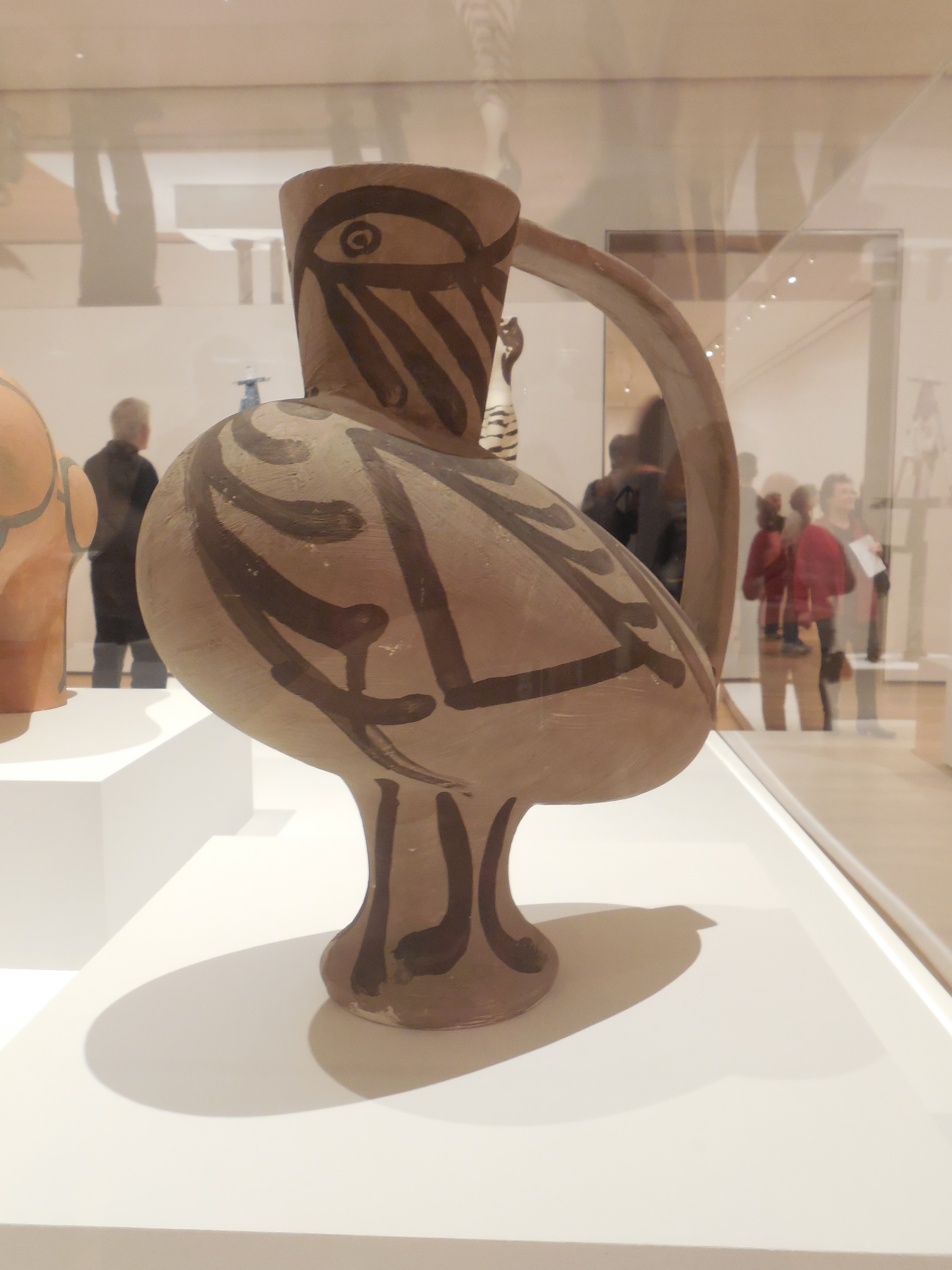
Keith Haring surprised me by displaying an awareness of art history, which didn’t fit with my preconception of him as a graffiti artist. This section shows the influence of early Greek vase painting patterns, which we had seen at Getty Villa in Malibu the day before.

Here’s a photo I happened to take at the Getty Villa Museum (which is a lovely way to spend an hour or two). Notice how Haring appropriated the geometric banding concept and unglazed terracotta in his vases, but we see Haring’s dogs and human figures in the registers instead.

Etruscan Vase from the Getty Villa Museum, photo by Beverly Shipko.

Influence of Indigenous Cultures

My favorite room was this one with 3 totem-like sculptures set amidst huge patterned Haring paintings. These bold, whimsically shaped totem had an indigenous feel from South America. Also they were very creative, and had such a distinctive character. Bravo!

When you got closer, you could see that each was engraved with unmistakably Haring imagery in yellow and against the black.

I particularly liked this view of the gallery, which evoked the complex patterns of Mayan and Aztec art that permeated South American cultures. Click here for an example of a typical Mayan portal to see what I mean.

The curators did an excellent job of placing the objects, and coordinating patterns of the paintings and sculptures so they played off of each other, creating a playful space with a lot of movement and energy.

Art History References

When I first saw work below, I thought about Michelangelo’s Creation on the ceiling of the Vatican’s Sistine Chapel. And then I turned the corner to read how he drew on art history and cultures for his imagery – specifically the Vatican. The irony of these naked creatures – with their tongues hanging out – imitating famous Vatican art was not lost on me. Only here we’re witnessing the creation of consumerism vs. the creation of Adam.

Haring hung out with a group of well known Manhattan artists, including Andy Warhol. Rhese paintings are his personal tribute Andy Warhol and his repeated imagery (think Campbell Soup Cans) with its consumerism theme.

This Tree of Life is a symbol that is traceable through all of art history. This was one of the more lyrical, optimistic and peaceful images in the show, with happy colors. I wish I had taken a photo of the wall tag to confirm there isn’t some sinister meaning behind it… as in many of his other pieces.

X Rated

Of course, no Haring show would be complete without a few sexual images and more than a few penises.

Art and Activism

Haring spent a chunk of his short career trying to change the world by calling awareness to issues that troubled him. He was fearless when confronting the establishment, whether he was expressing his strong views on AIDS (which ultimately took his life), apartheid and global social justice, systemic racism, capitalism, or the atomic bomb and nuclear warfare..

There are a lot of different interpretations of Haring’s work, but the following images indicate he was an original who pushed the boundaries of expression. He constantly experimented. He had courage to make and create art that would make viewers uncomfortable.

Capitalism

One of his favorite themes that he often returned to is capitalism, which he presented with the stereotypicial “capitalist pig”. As explained in the wall texts, Haring often used this image “in political cartoons to depict greedy businessmen… Haring’s pig paintings comment on the ills of capitalism and abuses of power in the name of profit.”

This work is a good example of a brightly colored Haring paintings with a very dark message.

Keith Haring, Untitled, 1983, Acrylic and enamel on canvas.

“This tarp painting portrays a pig spewing money-green vomit made up of computers, TVS, clocks, airplane, and other objects of modern life. The green vomit occupies the ground of the painting out of which little figures climb, suckling the sickly peg’s teats. This work is a monstrous depiction of the struggle of production in an era when everything was deemed consumable.”

In this next tarp painting, we see a weapon piercing the central handcuffed figure, representing a tool of oppression. The bleeding globe we see here often represents the worldwide social ills, including systemic racism right here in New York.

Systemic Racism, Social Injustice and Aparteid

In this particular work, red represents blood of a specific person, Michael Stewart, as well as the blood of the world. Michael Stewart was a young black artist, a student at Pratt Institute, who was brutally arrested for writing graffiti in NYC and died after spending 13 days in a coma. This work was created to call attention to systemic racism and social injustice right here in New York.

In addition, the bleeding globe is a symbol Haring often used to represent the ills of institutionalized racial issues such as segregation, in this case apartheid in South Africa – as indicated in the title that references Africa. Yet the US maintained trade ties with the country ostensibly to neutralize off the Soviet Union during the Cold War. In this respect, the red represents the blood of the world. The yellow figures remind me of the quote: “See no evil, hear no evil, speak no evil”.

Keith Haring, “Michael Stewart – USA for Africa,” 1985

Here’s another piercing of body parts by the devil himself using a long Pinnochio like nose as a sword. It’s an unusually powerful horizontal image, and I can only imagine what it means since I can’t read the wall plaque… Please feel free to use your own imaginations.

Frustrated by AIDS

Haring was a visible AIDS advocate, and used his talent to bring attention to the magnitude of the crisis. Here he promoted safe sex and the AIDS hotline. After being diagnosed with AIDS in 1998, he created the Keith Haring Foundation to provide funding to AIDS organizations to support education, research and care.

Keith Haring as a Capitalist Pig

Given his desire to fight against consumerism and for the oppressed underdog, it feels like a contradiction in terms that Haring embraced consumerism. He opened his own Soho Pop Shop which sold Haring branded merchandise in lower Manhattan.

A 1988 painting by Haring and items from his Pop Shop
Now you too can own Keith Haring slippers and refrigerator magnets!

Haring argues that his Pop Shop is a legitimate alternative avenue to reach the mass audience. And certainly we’ve all bought branded merchandise. But after making fun of the “capitalist pig”, Keith Haring essentially becomes one by opening this store.

End of Life Works

Similar to other artists, Haring’s last paintings foreshowed the end of his life. They have an unfinished quality and missing pieces. It’s almost as if he’s commenting on the work he still wanted to do to change the world.

To me, these two painting feel incomplete and yet satisfying at the same time. They provide a proper coda to a distinguished career.

Love

On the way out, there’s a mirror where Bonnie and I took pictures that summarized our feelings about this show.

In case you noticed, that is me in a wheelchair still recovering from a March leg injury. I enjoyed the show with Bonnie’s help.

Thanks to these two ladies for making it a wonderful day, especially Lauren who had the foresight to buy tickets way in advance.

It certainly looks like Lauren and Natalie loved the show too!

Before the trip, I was most excited about the All Consuming: Art and the Essence of Food exhibit at The Norton Simon Museum in Pasadena. It was underwhelming. However, it did get me to think about the delivery of food, and there are a few images that I’ll probably use in a food in art talk.

But the Keith Haring exhibit was the standout show. It’s so relevant today. That’s what I remember and recommend when I’m talking to people about my CA trip.

The rest of The Broad Museum has some pretty stellar art, enough that it’s worthy of a separate blog should I ever get around to it.

If you’re in LA before October 8th, I would highly recommend that you purchase tickets in advance for the show. Weekends are selling out quickly. It’s probably easier to get weekday tickets.

Is Haring’s art really for everybody?

That’s still the burning question. While your initial reaction may be “No, this art isn’t for me”, there’s an excellent chance it is for your kids and grandkids. So bring the family.

And if nothing else, you can appreciate a contemporary artist who was marching to his own drummer in his goal to create positive change.

Haring believed that art made the world a better place. It was his mission.

Today his art and activism deeply resonates in the upheavals that have occurred around the world. Many paradigm shifts have occurred following COVID. The pandemic brought many issues to the surface, including more awareness of inequities, racial issues (#Black Lives Matter); identity (#LGBTQI); plus Diversity, Equity, Inclusion, and Belonging (#DEI).

The world has evolved in many ways since Haring passed away in 1990. Yet the big unresolved issues feel somewhat the same, perhaps even more pressing today.

It’s important that we become more aware, tolerant and accepting of the inevitable social, economic and political change that is taking place outside of our own little silos. And hopefully there will be some compassion in the mix that will bring help to people who need it most. And Haring saw art as his tool to do just that.

In that sense, Keith Haring’s art is for everybody!

Posted in: Attractions, Inspiration, Museums, Uncategorized Tagged: #bevsbites #KeithHaring #ArtIsForEveryone #TheBroad #BroadMuseum #LosAngeles #graffiti #LGBTQ #BlackLivesMatter #DEIB #inspiration #contemporaryart

Sketching Outside My Comfort Zone

January 29, 2023 by Beverly

Today I had a little local art adventure – something new to me. I joined the Westchester Sketchers Group (no, not the shoes!) at the Neuberger Museum in Purchase, NY for an afternoon of sketching, sharing and chatting about art.

The Unexpected Sketch

I came home with this. Not at all what I anticipated going in since abstraction isn’t my thing. Quite a bit different from my typical food paintings, right? This abstract composition doesn’t even resemble any of the compositions in my Challenge paintings!

My interpretation of Louise Nevelson, 1973 at the Neuberger Museum

A Global Urban Sketchers Community

This is my second Westchester Sketchers event. The first being last week at the Hudson River Museum in Yonkers. This time around I knew what to expect. Thank you to my friend Betty for introducing me to this group, which is essentially a subsidiary of NYC Urban Sketchers and complement to NJ Sketchers. Both Urban Sketchers groups are a part of a worldwide sketching movement called Urban Sketchers. Who knew?

Their global motto is, “See the world one sketch at a time.” And maybe that’s what I’m going to do… starting by experiencing Westchester County and NYC from this new perspective.

The group meets in the lobby of the museum. Then we have about 2 1/2 hours to wander around the museum and choose something appealing to sketch, and create an image using dry materials (since we’re indoors in a museum). Afterwards, we share our work, and talk about the process.

My Process

After wandering around the museum the first time, nothing resonated with me. So I meandered through a second time. I remained undecided.

I considered these two pieces of art. Ultimately, I passed on the Richter since I thought it would do better in color (which I didn’t have). The African sculpture was still a possibility. Eventually I realized I was short on time (already lost an hour) so I better pick something and just do it!.

You can see another member of the group sketching away in front of this African sculpture.
Hans Richter, Wall Wood Relief IV, c. 1970 by Richter.

Eventually I paused at this Louis Nevelson (below) after reading the title. Even though it’s a black wooden wall relief, it is called Day/Night XX. This name intrigued me since I thought the more appropriate title would be Night, with Day being a white version of this wall relief. And Nevelson did work in white.

So I decided to sketch this as if it the original Nevelson before me was white and titled Day.

Materials

I sketched the whole drawing freehand, often standing (which I do at home when painting on an easel), using a soft graphite pencil (on the right) with a kneaded rubber eraser. (Note to self: Throw a ruler in my bag next time.) The smooth, stiff paper is called Bristol board, which I use for my 6 x 6 inch Oreo Cookie drawings. This was about 2/3 done.

Kneaded eraser, 6 x 6 inch Bristol board, and a soft artist pencil.

All of a sudden there was only 15 minutes left to add the contrasting, darker shading and small details, like the little staples holding those horizontal wires and the shadows on the horizontal molding near the bottom.

Time to stop and meet up with my fellow sketchers, uncomfortable though that is. The “final” version.

As I look at this, I realize my choice of subject was at least partially driven by my left-sided math brain, which was always drawn to geometry when I was a math major. How I always loved the challenge of solving geometric math problems! I guess I still do only in a different way.

Stretching or Sketching Outside My Comfort Zone?

Overall, today was a positive experience – even if I was uncomfortable going in. More so last week when it was my first time. Usually my paintings are carefully thought out, often ruminating in my head for weeks. Quick sketches are a radical departure for me.

However, I believe it’s a good thing to try new approaches and get out of my comfort zone. And to open myself up to different comments from other artists, as well to see how other artists approach this challenge. That’s how we all grow artistically and unlock new opportunities.

And no, the headline is not a typo. The best headline that captures the spirit of today is still Sketching Outside My Comfort Zone and not stretching – although I did a lot of both today and especially over the past few weeks.

Maybe that could be the subject of my next blog….!

Posted in: Attractions, Drawings and Prints, Inspiration, Museums, Uncategorized, Work-in-Progress Tagged: #bevsbites #drawing #sketching #WestchesterSketchers #NYCSketchers #NeubergerMuseum #museum

Kusama: Cosmic Nature at the NYBG

October 11, 2021 by Beverly

What a gorgeous day it was when I went to the New York Botannical Gardens to see Kusama: Cosmic Nature which runs through October 31, 2021. 65 degrees and sunny. Perfect. I still get excited to see art again in person instead of on zoom.

Knowing I was seeing a sculpture installation by Kusama, aka The Dot Lady, I put on my polka-dot mask to get in the spirit of things. And what do you think greeted me at the entrance to the garden?

Polka dots, of course! I fit right in.

The cool thing about this sculpture was how dramatically it changed as you walked around this whimsical sculpture, called I Want to Fly to the Universe.

From the back, it looked like a completely different sculpture.

What I like most about the Kusama show is the variety of the installations. It turned out to be important to look at the map to see the highlights.

For example, one unassuming building near the entrance delighted with a mesmerizing experience of being indoors in an unending room of light-infused polka dotted pumpkins, called Pumpkins Screaming About Love Beyond Infinity, 2017. I would have totally missed this without the map.

A short distance away, I came upon this green house-like structure teeming with red flowers of sorts, appropriated named Flower Obsession.

As I waited online to enter, I was given this sticker on plastic and was invited to place it where I wanted. This was truly a participatory, interactive experience, a nice change of pace.

When I walked in, I could see flowers everywhere! From the wheel barrow, to the dining room table and chairs, everything was covered in red flower stickers. I took my time looking, carefully picking the territory I wanted to mark with my sticker.

I finally found some virgin territory on this philodendron plant in the corner. You can see my sticker on the right side of the leaf. It felt strange putting a sticker on a living plant, but I did it anyway. Notice how different stickers with blue centers and larger pink-ish daisies had been handed out to previous visitors.

Then I headed off to the conservatory, but was drawn instead to this large polka dotted series of irregularly shaped fingers, which turned out to be a pumpkin in motion. You can feel the motion from this view. I probably should have figured out this was a pumpkin since Kusami is obsessed with them, which she exhibits frequently around NYC and the world.

While I was waiting in line to walk through Dancing Pumpkin, a fellow visitor actually asked me if I planned my mask around the visit! Someone actually noticed.

I had plenty of time to study this view since only a few people were admitted at a time, not so much from covid precautions, as much as to prevent damage from having too many visitors walk through. The guard said this artwork had already been repaired several times.

As I finally approached Dancing Pumpkin, these finger like projections beckoned, and somehow reminded me of Louise Bourgeoise’s spider sculptures; I’m not sure why. Maybe because these spiders and pumpkin installation are so large, and are both representative sculptures with “legs” that you walk through, unlike so many abstract installations, such as those by Richard Serra. (Ok, maybe the spider comparison seems like a stretch….but it works for me.)

This is the view from inside out, where the pumpkin’s legs look like octopus tentacles or giant drips, take your pick. Ever hear of an old horror movie called The Blob?

I decided to look for a signature and finally found it.

After the Dancing Pumpkin detour, I wandered over to the ticketed Enid A. Haupt Conservatory show to be greeted by this series of whimsical, exuberant polka dotted flowers – which seemed to carry on the dancing theme.

I was delighted to find this monumental golden pumpkin hidden amidst a larger greenhouse installation, but it felt so static after seeing and experiencing Dancing Pumpkin and those exuberant flowers.

There were more polka dotted flower sculptures installed in the outdoor reflecting pool.

I couldn’t resist taking photos of these vibrant tulips scattered around the perimeter of the reflecting pool, I wondered if I could ever paint them, but they look unreal to begin with. Maybe I’ll stick to photography…

I could see the Infinity Mirror Room from a distance, which was closed when I went due to covid.

Webmaster Laura was kind enough to share her more recent photos of the Infinity Mirrored Room, saving me the $10 entry fee.

Kusama’s installations are very cool! And this one looks particularly colorful.

Then I encountered a series of white on red polka-dotted wrapped trees, a la Christo’s wrapped installations of islands, the Arc de Triumph, and more. Kusama presents us with her own unique perspective on wrapping in Ascension of Polka Dots on the Trees.

Polka Dot Row, Photo by Webmaster Laura Sloofman

Finally, I went in to the LuEsther T. Mertz Library Building to see the Cosmic Nature show. Can’t miss that polka dot banner, can you?

More polka dotted cellular creatures greeted you in the entrance hall.

As I entered the gallery, I quickly encountered this sketchbook of flowers. Apparently Kusama filled numerous sketchbooks with flowers at a young age in Japan. I was enchanted by these drawings, which I couldn’t photograph myself, especially since our upcoming Ikebana lesson had us drawing details of our arrangements.

After studying the few Kusama’s drawing included in the exhibit, I was eager to get started on my own sketches. I hadn’t drawn flowers in years – I was too busy with food and vending machines.

As you moved deeper into the gallery, Kusama’s vibrant, whimsical, biomorphic cellular shapes and colors greet you, like old friends.

There was one painting called….that spoke to me. It called to mind my Cosmic Oreo.

By this time, it was past 1pm and I was hungry for lunch. My last stop on the map was this major installation. From a distance, I thought it only merited a quick walk through.

As I got closer to Narcissus Garden, 1996/2021, I realized I had been too quick to judge. I had underestimated the multisensory aspect of the installation. So I dug deep in my purse and found a small pumpkin seed snack bar (how appropriate for this show!) to tide me over.

The first surprise was that each sphere reflected the white fluffy clouds floating in the blue sky, like mini holograms of the cosmos.

Then, what looked like a static installation was anything but. The silver balls drifted slowly from side to side as the gentle breeze kicked up a notch. I took a seat and watched them move back and forth, which put me in a meditative state for a while.

Not only did the balls line themselves in natural rows, which was unexpected, but they clinked against each other making subtle sounds. The longer I stayed and the more present I became, the louder their “voices” seemed.

As I walked out, the balls were on their slow, steady march across the pond once again, accumulating along the opposite side.

This was a satisfying end to a lovely day.

I would highly recommend a visit to the NYBG to see the show, and to enjoy the gardens. The restaurants are open, which makes it easier to spend the day there. Reservations are required, and are sometimes more difficult to get than expected, even for members. So make reservations ahead of time especially on the last 3 weekends in October before Kusama Cosmic Nature closes.

To get the complete Kusama experience, reserve a combination ticket including both the indoor and outdoor installations, called the KUSAMA Garden & Gallery Pass ticket. A separate $10 ticket for interior access to Infinity Mirrored Room—Illusion Inside the Heart (2020) is required with the purchase of a KUSAMA Garden & Gallery Pass or KUSAMA Garden Pass. Tickets are highly limited and expected to sell out, if they haven’t already.

Remember, if all else fails, you can probably get a Garden Pass to see everything in this blog post that’s outdoors – not to mention the rest of this expansive garden. I just made another weekday reservation for myself to stroll by and view Kusama’s whimsical installations again, this time against the beautiful ever-changing cosmic fall colors. I wonder if the silver balls in Narcissus Garden will be reflecting some rusts and reds this time around.

Hope you make time to go. Enjoy!

Posted in: Attractions, Inspiration, Uncategorized Tagged: #bevsbites #NYBG #Kusama #NewYorkBotannicalGardens #Kusamainstallation #outdoorsculpture #polkadots #pumpkins #fun #garden #art #takeabiteoutoflife #NYC #Bronx #nature

I am… “Loving Vincent”!

October 10, 2017 by Beverly


For those of you art lovers and fans of Vincent Van Gogh, do I have a film for you! it’s called Loving Vincent and it’s one of the most innovative movies I have ever seen.

Over 6 months ago, I first discovered this Loving Vincent trailer on Facebook (2.8 million views). As a painter and art historian, I was immediately hooked by the concept of the first full length animated hand-painted movie. Loving Vincent used over 65,000 paintings by 100 artists, all working in the style of Van Gogh with his bold technique using thick impasto brushwork and vivid colors.

My expectations were pretty high, and a part of me wondered if I was setting myself up for disappointment. It turns out my expectations were different (not better or worse), but I was definitely not disappointed. 

Vincent Van Gogh was a prodigious letter writer to his brother, the Paris art dealer, Theo Van Gogh, who supported him financially and emotionally. The plot revolves around the late delivery of one of these letters by the postmaster, Joseph Moulin, and his son, Armaud, who he sends to Paris for the delivery. Along the way, Armaud raises questions about Van Gogh’s death, building some suspense along the way. Coming into the movie, I didn’t expect any plot, just a rehash of the letters.

Spoiler alert: I had been taught in school that Vincent definitely committed suicide, and never questioned that. Loving Vincent raises the tantalizing possibility that the artist was murdered, and made a strong case for reasonable doubt. After going home and reading some of Vincent’s last anguished letters to Theo – letters that were not incorporated into the movie – I wasn’t as sure. Nonetheless, the thesis is intriguing.

While the story added some unanticipated drama (admittedly not completely resolved), the hero is the unique, creative, innovative execution. In other words, the devil is in the details. And what glorious, active brushwork dominates the screen for the entire 90 minutes! Bravo to all the artists! 

Before you see Loving Vincent, I would recommend taking a quick peek at some of Van Gogh late paintings. That way you can recognize them, and fully appreciate all the planning that went into this hand-painted animated movie. Just google Van Gogh’s Auvers paintings.

In the film, we are gradually introduced to a series of Van Gogh portraits which are transformed into living, breathing characters moving within the spaces of Van Gogh’s painted world below, such as Cafe Terrace Place du Forum, Auvers Church, and Wheat Fields – with its animated crows.


Better yet, watch this 6 minute documentary which gives you the behind the scenes view of how this movie masterpiece was produced. We learn about how directors Kobiela and Welchman began by shooting their story as a live-action film with actors in costume again a green background. In this example, we see the live-action shot of Dr. Gachet on the left, Van Gogh’s friend and doctor (painted version is on the right).

Then the paintings were executed and integrated with the live action color footage, often interspersed with black-and-white flashbacks (which was a surprise – and effective!). The documentary also explains how Van Gogh’s vertical paintings had to be adapted to the horizontal screen format. Apparently the artists did that seamlessly because I didn’t even notice.

Loving Vincent is a labor of love. I just wished the producers had slowed down the final credits, when images of the live actors are juxtaposed with Van Gogh’s original portraits and drawings, together with the hand-painted screen versions they inspired – and quotes. I didn’t have time to internalize all the carefully conceived elements that were meticulously presented here. 

I guess I’ll just have to go back to see Loving Vincent again – and feel the love.

Posted in: Attractions, Inspiration, Uncategorized Tagged: #bevsbites, #LovingVincent, #movie, #Post-Impressionism, #VincentVanGogh

Beyond Fashion

August 27, 2017 by Beverly

This was one of the first intriguing designs I encountered recently, courtesy of the Costume Institute at the Metropolitan Museum.

But is this fashion? It’s certainly not wearable! Or is this art? Maybe sculpture? 

The arms are bound up like in 4th century B.C. Tanagra figures – with the addition of lumps in odd places. They reminded me of this small bronze Hellistic statuette of a veiled and masked dancer from the 3rd – 2nd century B.C. Greece in the Met’s own collection

Another image that greets you early on is this exuberant, overblown paper costume, that recalled another unwearable outfit – Woody Allen’s Hydrovac suit in the 1973 movie Sleeper with Diane Keeton. Ok, so I let my imagination go a bit wild, which is what the designer did throughout her career.  Not a comparison the artist intended, I’m sure! 

Many thoughts and questions raced through my mind when I went back for a second visit to a provocative fashion exhibit at the Metropolitan Museum by Rei Kawakubo/Comme des Garçons (CDG) called “Art of the In-Between” (closing September 4, 2017). 

For those of you who thrive on imaginative, ambiguous, thought-provoking concepts that are open to many interpretations – and avant garde artistic endeavors – you’ll love this show! What an appropriate name too. It certainly is in-between, on so many levels. 

Be warned that this is a polarizing show. It was fascinating to watch the reactions of people walking in. Some of them looked energized, excited and blown away by the unique, dynamic architectural setting that greets you head on. This group had animated discussions about the designs, and took out their cell phones to capture a constant stream of photos and videos. 

Not surprisingly, people in this group tended to be younger and wildly dressed. 

On the other end of the spectrum, museum goes looked dazed (most often older men like Jay) or disappointed and eager to leave (like my daughters with high expectations from the Met Gala celebrity previews). In her New York Times review of this show, Roberta Smith called it Dressed for Defiance in her review, which is definitely worth a read for the context. Naturally this approach is not going to appeal to everyone.

But even the detractors thought the the environment of inverted, pulsing shapes, forms and levels was fun, and unlike any other exhibit the Met has put together.

“Art of the In-Between” grew on me the second time around, after the initial shock from the first visit had long worn off. Skimming the brochure helped since there were no wall tags posted anywhere, just dualistic floor titles like Design/Not Design, Fashion/Antifashion, Fact/Fiction and Clothes/Not Clothes.

Kawakubo synthesizes so many artistic traditions that my head was swimming. The variety of materials – from packing paper, plastic, lace, feathers, was stunning.

Naturally there were wedding dresses with decorative jewelry that reminiscent of Buddhist Bodhissatva statues. The difference between this and most collections is this is called Broken Bride and is envisioned as part of the cycle of birth, marriage and death. Not a happy thought for a wedding.

Headpieces were an integral part of this show’s experience, and varied significantly from collection to collection.

Having said that, here is a grouping without heads that reminded me of the years I spent in corporate American trying to look like my male counterparts by wearing suits that fit into a man’s world, but with feminine touches (think blouses with little ties at the neck). I was somehow delighted by this spoof on the classic grey suit with four poofy arms.

These two pieces, entitled Ceremony of Separation, struck me as more sculpture than anything else. The brochure explains they represent a poignant mediation on the fragility of life and the finality of death. I admit that I didn’t get any of that while in the show, and missed those wall tags that would have enlightened me about the designer’s intentions.

When I saw these pieces with their mops of black “hair” covering different body parts, I thought they could be muppet characters on Sesame Street.

One of the reasons I wanted to see this exhibit was to better understand what inspired celebrities attending the Met Gala to make their own fashion statements. I was most intrigued by the over-the-top ensemble chosen by Caroline Kennedy. It seemed like as awful lot of fabric to me on such a slim person. (Would Jackie have ever worn this?) Vogue called her selection perhaps one of the biggest surprises of the night—and one of its best. 

I went through most of the show without having any inkling of why Caroline Kennedy chose such a big dress with so many different patterns and colors, which turned out to be made by CDG. Near the end of the show, I finally found a  bridge between her outfit and this show in a collection of Asian inspired clothes that actually felt more like fashion that other sections of the show. 

The silhouettes evoked traditional Japanese and Chinese garb from various periods. The rich fabrics were packed full of gorgeous textures, patterns, flowers and colors, which explained Caroline Kennedy’s flower patterns and oversized gown. 

Walking into the show, perhaps my initial expectations were too high after the blockbusters China: Through the Looking Glass (815M visitors) and Alexander McQueen: Savage Beauty (661M visitors).

If I were designing the physical installation, I would have kept looking for a better way to integrate information about the designs to viewers. I had to work too hard, even now writing my blog with the photos on the screen and the large size 16 page brochure in front of me. I still feel like I missed a lot.

Having said that, if you’re a designer or a fashionista following fashion trends, it would still be worth the trip to see this show.  And you have you have 8 more days to do it. 

 “Rei Kawakugo has consistently defined and redefined the aesthetics of our time…she upends conventional notions of beauty…Her fashions… resist definition and confound interpretation. They can be read as Zen koans or riddles devised to battle, bemuse and bewilder.” -Brochure Introduction

Just be open. This is not your mother’s fashion show. Expect the unexpected, and you won’t be disappointed. 

Posted in: Attractions, Uncategorized Tagged: #bevsbites, #fashionexhibit, #MetropolitanMuseum, #ReiKawakuboCommedesGarçons

Met Some “Perfect Strangers” in the NYC Subway

May 25, 2017 by Beverly

After enjoying Chuck Close “Subway Portraits” mosaic installations, I opted for the Second Avenue subway to 72nd Street (instead of the Lexington Line) on my way to the Frick Museum. This time it was Vik Muniz’s “Perfect Strangers” that wowed me with larger-than-life mosaic figures like this.

Detail

Even though it was a quiet day and the subway was empty when I arrived, it didn’t feel that way. I never felt alone with all the “Perfect Strangers” of everyday New Yorkers scattered strategically on the walls. And they were perfect from concept to execution in their breadth of subjects, whimsey, range of emotions, and just plain presence.

So perfect that sometimes it was hard to tell the difference between the real people and mosaic figures from a distance. Can you guess which figure is live in this photo? 

Vik Muniz shows us a wide range every day people. The poignant pictures of kids and parents stood out. 

Like the Chuck Close installation, the mosaic details were extraordinary too.

A trail of red balloons was a unifying element that kept popping out in unexpected places. The balloons brought out the silliness in me – as well as the live perfect strangers who were so willing to take my photo (everyone smiled when I asked!)

Apparently I wasn’t alone in my attraction to these balloons. I found this man looking up at one of the entrances, and wondered why – until I looked up and saw the red balloon way up at the top. As I got closer, I was drawn to the variety of colors scattered among yellow glass tiles in his jacket.

Many of the portraits depicted tradespeople in work clothes, everyone from a repairmen, rabbi to a nurses – and Vik Muniz’x son dressed in a tiger costume (Tony the Tiger?).

After I got home and did a google search, I found out this unobtrusive man carrying a green bag of vegetables was Daniel Bolud.

Courtesy of https://ny.eater.com and Daniel Bolud/Facebook

These underground masterpieces recalled  the William Penn “Small Trades” photography series I had just seen at the Metropolitan Museum of Art, which I would recommend.  

What made these figures extraordinary is that I could identify with so many of them – especially this man rushing for his train when his briefcase flew out of his hands, spewing papers all over. I felt sorry for him.


I saw myself in the tourists taking photos, and the woman carrying her New York bag (like the one I used when I first moved to NYC).

I could image myself trying to navigate the subway system with luggage.

The bonus was that I always felt well protected by New York’s finest.

Between the Vik Muniz installation at 72nd and the Chuck Close installation at 88th, I saw one of the greatest art shows of the entire weekend in the subway. The two installations complement each other perfectly. I can’t wait to explore the 96th and 73rd Street stops.

As Rebecca Sobel wrote, the best new museum in New York City is underground. Bravo! 

Posted in: Attractions, Uncategorized Tagged: #bevsbites, #SecondAvenueSubwayart, #VikMunizMosaics, #VikMunizPerfectStrangers

Up Close in the NYC Subway

May 21, 2017 by Beverly

For the first time, I had the pleasure of taking the new Second Avenue Subway line (known as the “Q”) from 88th Street. I was staying at Laura’s apartment for a long weekend, and was in a big hurry to get to a new age musical event 60 blocks south. 

So I wasn’t paying too much attention to my subway surroundings (not a good thing in NYC), until I saw this huge, vivid, in-your-face image staring at me from the wall. I stopped in my tracks. “Could it be a Chuck Close self-portrait?”, I asked myself.

I walked closer and touched the mosaic, which I always wanted to do in museums and never could. “Could this be Chuck Close’s eye?”


Yes, it could. And it was. Suddenly I remembered reading about major public art installations in the new subway line, including the Chuck Close “Subway Portraits”, but had long forgotten about it living in the suburbs.

The mosaic installations are amazing! How does Chuck Close do this? From short distance away (I’m trying not to keep repeating the word close; what a coincidence that’s his name…or is it?), the mosaics look totally abstract, but far away they form a realistic portrait. 

On the way home, I come back to explore, and was glad I did. 

I found another Chuck Close self-portrait, this time gigantic and more detailed, showing every facial imperfection that helped make him famous. 

Compare the eye to the one above. Take a look at Chuck’s mustache. It’s hard to believe this is made out of pieces of glass or ceramic tiles rather than being painted.

The striking mosaics are placed strategically near the escalators, elevators and exits. This well-known portrait of the composer Philip Glass was a welcome relief from that steep escalator ride.

Then I came upon this delightful child. To keep the body parts theme going, here are close-ups of an eye and mouth.


I didn’t want to leave you without including a few of the women. The detail below shows how Close used circular mosaic patterns too (maybe of the ear? Your guess is as good as mine…).

By now you’ve had enough scrolling, so I’ll end by saying this is public art at its finest. There’s a lot more where this came from at 88th street and other Second Avenue stops on Manhattan’s upper east side. 

It’s art you can experience  – up Close and personal – by one of the rock stars of American art. And it’s free (almost)!

Posted in: Attractions, Uncategorized Tagged: #chuckclose, #ChuckCloseSubwayPortraits, #publicart, #SecondAvenueSubwayMosaics, #subwayart, 3bevsbites

$1 Art Vending Machine

March 4, 2017 by Beverly

After 2 days visiting hundreds of exhibits during Armory Art Fair Week, there’s one interactive installation that stands out above all others  – and that’s Art Vending Machine $1 Paintings. 

Booth 512 on Pier 94 at the Armory Show, Gallerie Forsblom, Helsinki, Stockholm

I love it! Apparently so does the Guggenheim who is thinking about purchasing this.

Located on the 94th Pier (Booth 512) at the grandaddy Armory Show (through Sunday, March 4), Art Vending Machine $1 Paintings attracted long lines whenever it was operating. The novelty of watching an original piece of artwork pop out of a huge vending machine for $1 was irresistible.

Simply put in your dollar, choose the concept you want from the list, tell the representative who talks to artist through a cardboard tube in the wall, wait a bit, and out it comes. Then you have your photo taken with your original art.

The buyers all walked away with big grins, proudly holding their abstract compositions, many commenting they were going to frame their creations.

This was one of the most innovative and memorable installations I have even seen at an art fair. It has special appeal to me as a painter of vending machines (Icons of the Candy World, Icons of the Chip World), my most recent being Super Foods.

“Super Foods”, Vending Machine Series, by Beverly Shipko, Oil on wood panel, 5 x 7 inches

With 10 paintings in the series so far, Art Vending Machine $1 Paintings opened up the world of possibilities to explore further. I plan to go beyond broccoli and think broader. As the metaphorical visual below implies, this theme can incorporate any material – even the kitchen sink.

So can I.

Posted in: Attractions, Galleries, Inspiration, Uncategorized Tagged: bevsbites

Unfinished

November 7, 2016 by Beverly

Unfinished? Or finished? I always struggle with this.

That was the debate in Saturday night’s New York Philharmonic program notes for Schubert’s Unfinished Symphony. A stack of unfinished music, described by some as “torsos” or fragments, were found when Franz Schubert’s life was cut short by syphilis at age 31. Schubert sent this particular piece to a friend who kept it hidden in a drawer for 40 years.

Dubbed Unfinished by posterity, the artist’s own intentions are unclear. Originally called Symphony No. 8 in B minor, D.759, the two movements we heard certainly sounded finished – and beautiful – to me (judge for yourself), although it departed from the typical four movement format of Schubert’s era.

Was Schubert planning to come back to it and flesh it out into four movements? Or did Schubert consider this piece finished since he put the score down long before his death? Were other movements simply lost?

The road is littered with unfinished creative work, whether it’s music (Mozart Requiem), painting (Da Vinci’s sketchbooks) or architecture (Gaudi’s Sagrada Familia). As an artist who paints half-eaten food that are inherently unfinished, this is a subject that intrigues me: When is a painting finished? The simplest answer is when the artist says it’s finished. Only life isn’t always that simple, as was the case with Schubert.

This complex subject was tacked by the Metropolitan Museum in the Met Breur’s inaugural show Unfinished: Thoughts Left Visible. Although the show closed in September, it made a lasting impression on me – and on mostly everyone else who saw it, especially those close to the creative process.

I’ll cover a few of the highlight and issues, beginning with this hauntingly beautiful metal point, drawing and oil of Saint Barbara by Jan Van Eyck (1437) on the first floor of the show. Is this an exquisitely drawn preparation for an unfinished painting, or a finished drawing with a touch of color?

img_1201

Leonardo Da Vinci painted this elegant Head and Shoulders of a Woman (1608-14) with beautifully disheveled hair (mine should look this good!) using oil, earth, with white lead pigments on poplar. Note how finely painted the delicate features of the face are relative to the sketchiness of the hair. Unfinished perfection?
img_1206

This dramatic El Greco, The Opening of the Fifth Seal (1608–14), is an unfinished painting that was heavily damaged and restored, and has been cut down from its original size. Yet the Met thought enough of it to purchase it for their permanent collection.

img_1211

The concept of non finito (a theme in this show, literally Italian for unfinished) can be applied to this later Rembrandt van Rijn of his companion Hendrickje Stoffels (mid 1650s). Rembrandt was an artist who experimented with unfinished paintings, and came back to this one over a period of time. Perhaps he intended to leave this unfinished, or was content to leave the rough hands and drapery as is since it is an informal portrait.

img_1216

It’s interesting to look at late Rembrandt, and late work of other artists for that matter (Turner is coming up), which tend towards less detail rather than more. Why, you might ask? Is it simply that elder artists suffer from declining vision and health? Perhaps artists feel they only need to capture the essence or spirit of the subject, having already established their technical skill over their distinguished careers. Or maybe they paint more for themselves at this point in their life cycle.

Contrast late Rembrandt with the exuberant mature style of another Dutch painter, Frans Hals, in The Smoker (ca 1625-27) with its free, sketchy style and magnificant brushwork. The immediacy and perceived realism of these paintings works best when seen from a distance. I personally find the rough style of late Hals exciting and am captivated by the loose brushwork.

img_1221

This clearly unfinished self-portrait by George Romney, 18th century British painter, was admired by his friends and offspring for its spirit, yet questioned for its incomplete state. How I wish I could carry this off! Yet this was prized by several generations of Romeys.

dscn5234And now we come to my favorite room of the entire show. A lovely room full of foggy, ethereal mood paintings typical of late William Mallard Turner, including Sun Setting Over a Lake (ca. 1840) and The Thames Above Waterloo Bridge. 
img_1227

img_1228

These mature works, which were found in Turner’s studio after he died and donated to the Tate as part of the Turner Bequest, verge on being pure abstractions with their free brushstrokes not generally associated with painting of this period. They were admired for their non finito aesthetic, and foreshadow the Impressionists and the abstract art to come out of America (Helen Frankenthaler, for example).

On the second floor of the show, Picasso greets us on the second floor with a black and white painting of The Charnel House (1944-45), which he referred to as the massacre. While the specifics remain somewhat of a mystery today, this unfinished work with areas of canvas showing together with compositional changes, reminded me of  Picasso’s Guernica – a MOMA favorite for so many years – in its subject and grey palette befitting the darkness of war. Picasso thought this was finished enough to donate to National Association of Veterans of the Resistance in 1936.
img_1244

A second Picasso work on paper seems conceptually like a two-part art class assignment (color first, then black and white), but somehow works as a painting.

dscn5252

Next I enjoyed these two clearly unfinished works. The first is this charming Vincent Van Gogh of a Street in Auvers-sur-Oise, painted in 1890, a year before he died, perhaps explaining the bold blue strokes of the sky set against the raw canvas. The second is Gustav Klimt’s Posthumous Portrait of Ria Munk III, with bold patterns and colors swirling around the drawn figure – a definite crowd pleaser.

img_1242

dscn5242

Then the exhibit shifted to more contemporary 20th century work, including Jackson Pollock’s Number 28, 1950. Pollock poured and threw paints in a seemingly haphazard manner onto canvases placed on the ground (rather than an easel), without a central subject. The paint literally runs off the edges of the canvas, implying a sense of infinite time and space without an ending.

dscn5275

We see Alberto Giacometti with Annette (1951) who almost made a career out of reworking and reworking paintings for years in a deliberately unfinished way, so that the creative process was evident to viewers. In fact, Giocometti never thought any of his works were finished!

img_1224

I smiled when I saw the next juxtaposition of these two works that reminded me of all my paint-by-number kits that I enjoyed as a child.  Andy Warhol’s Do-It-Yourself (Violin), 1962, and Kerry James Marshall, Untitled, 2009 (who currently has a major show at Met Breuer) brought back a lot of pleasant memories. Marshall follows the time-honored tradition of depicted an artist holding a palette while working on a painting – in this case, a paint-by-number painting. What a painting in a painting!

dscn5267
dscn5271

The theme of the show then shifted to decay and decline with works such as this seemingly disintegrating sculpture by Urs Fischer “2” (2014) in cast bronze, oil paint, palladium led, clay bole, child gesso and rabbit-skin glue. The process involved creating and destroying, suggesting decay and perhaps sexual violence.
dscn5281

Hans Hoffman went even further in painting with this creation and deconstruction pattern process in Woman, I (1950-52). Hoffman returned to this subject time and time again, scraping, wiping, blotting, with a disregard for the outline of the form (unlike Klimt) that resulted in a sort of visual chaos that was intentional.img_1263

Jean-Michel Basquiat builds on the notion of chaos and irreverence in Piscine Versus the Best Hotels (or Various Loin), 1982. The painting seems to be coming apart at the seams with its exposed stretcher bars, irregular joints, and rather quickly attached photocopies. Words and puzzling images that appear to crash into each other, reminding us of street art and graffiti. img_1271

Rodin’s elegant sculptures of hands greet us in the last large room in this show of various sculptures. Smooth delicate carvings of fragmentary hands are set again contrasting textures of rough hewn stone, harking back to Michelangelo’s Unbounded Slaves and Medici Madonna in the non finito spirit.

img_1262

Menardo Ross further explores the notion of depicting body parts in a series of eerie marble heads lying on a dark stone platform. I spent a lot of time wandering around  this room, which was particularly interesting aesthetically and conceptually within the context of this show.

img_1264

This was a provocative exhibit that received less than enthusiasm reviews from the critics, hinting that this show wasn’t enough of a  revolutionary breakthrough inaugural contemporary show. The critics seemed to fault the Met for drawing from its encyclopedic collection, although I do agree that the two floors felt like two separate exhibits. The New York Times review called it Thinking Inside the Box, hardly intended as a compliment. But for all of us interested in the exploration of the creative process, it was fascinating!

In the spirit of this exhibit, I proudly show you one of my incomplete paintings, which has been waiting patiently in my studio. Normally I wouldn’t have posted this one so early in the process, but I gave myself permission after spending a lot of time in Unfinished.

dscn3510

There are a number of unfinished paintings in my studio. Why? Obviously, I’m still alive, so that’s not the reason. And I’ll go on record saying some are in the concept stage, and nowhere near completed. Certainly there were plenty of distractions the last few months with many family  trips and a daughter settling back in New York after living away for many years, perhaps contributing to a lack of focus and a painters (and blogging!) block.

Sometimes you really never know why a painting remains unfinished. Here’s one that sat around for a long time after a little visitor ate the subject! Fortunately I had taken a photo of this Oreo. True story.

img_2801

My personal insight after seeing this show:  I think I should be more tolerant of my own unfinished works. There’s nothing to be embarrassed about. And it’s ok to stop before every i has been dotted and every t has been crossed. In fact, it’s an area I want to explore.

What I took away from Unfinished was that I am just carrying on an age-old tradition going back centuries. And a glorious one at that.

Posted in: Attractions, Inspiration, Uncategorized Tagged: #MetBreuerUnfinished, #SchubertsUnfinishedSymphony, #Unfinished, #unfinishedpaintings

Vlisco Surprise: A Feast for the Eyes

October 28, 2016 by Beverly

Just sometimes you get lucky when exploring new exhibits and gallery shows.

That was certainly the case this past Sunday when Jay and I visited the Perelman Building, an Art Deco extension of the Philadelphia Museum of Art, featuring special contemporary art exhibits.

img_1755

As we entered a show dedicated to Vlisco, a company I had never even heard of, I didn’t know what to expect. An involuntary WOW! escaped my lips. To say this was a surprise is an understatement.

img_1732

img_1724

The vibrant fabric colors, the creative silhouettes, and the innovative African fashion designs for all occasions pulsated against rows of creative patterned fabrics manufactured by Vlisco – a name that I won’t soon forget.

img_1737

It turns out that “Vlisco: African Fashion on a Global Stage” is an visual feast for the eyes. Only we’re talking fashion feast rather than food this time around.

While I’m not a fashionista like my daughter Bonnie, I was mesmerized by this room and walked around several times taking iPhone photos along the way. Somehow I left my favorite camera charging back in New York…

I kept coming back to this Gala Dress with its memorable silhouette, intense colors and patterns. The shape reminded me of a mermaid – but what a mermaid!

img_1738

I found one wedding dress in this collection, the dress with the white veil (middle right) full of patterns and colors – but still clearly recognizable as a wedding dress.

img_1733

This display features one-of-a-kind designs made specifically for this show. Atypically, I was told the mannequins were made (and later shaved off!) to fit the dresses, not the other way around (i.e. dresses made to fit mannequins). As a result, the exhibit installers had a unique challenge on their hands, and are to be commended.

After admiring my favorite dresses, I directed my attention to the resin fabric sheets on the wall. The wax print designs were pure fun, and included everything from abstract patterns, body parts (think symbolic eyes and hands), and pop culture images of shoes, rings, maps, and whatever else one can think of. The designers are only limited by their imaginations.

img_1723

img_1718

img_1722

One wall the demonstrated the wax resin printing process (the brown plate is on the upper right), reminiscent of screen printing but using wax, which made me appreciate the intensity of the colors and rhythms all the more. It’s the wax process that preserves the bold, crisp colors and makes this the medium of choice.

img_1735

While I was talking to Jay (who wasn’t as mesmerized looking at clothes as I was, no matter how creative), I remembered a New York Times article about this a while back (turned out to be July), which I just found here. The Times talked about the Vlisco show being the most vivacious show under the umbrella of 5 shows called Creative Africa, three in Perelman.

If you’re lucky enough to be in Philly before January 22, 2017, stop by and get a flavor of an exciting Dutch fashion manufacturing company with a clear design niche. Vlisco is a fascinating and unique company which has been creating Western African and Central African textiles in the Netherlands for over 170 years – a surprise since I assumed these fabrics came out of Africa rather than Europe.

You can see how active Vlisco is from their extensive website. A few pages that I thought were interesting included the news around the world and  a limited edition fashion page (click on the swatches to see the dresses).

Certainly the traditional Art Deco design of the exterior had us fooled. Once again, I was reminded that you can’t always judge a book by its cover. Be open. Try new things. Sometimes you’ll be richly rewarded.

Posted in: Attractions, Inspiration, Museums Tagged: #africanfashion, #vlisco, #vliscotextiles, #waxfabricprints, bevsbites

The Elusive Lighthouse Photo

June 24, 2016 by Beverly

Jay and I just came back from a 2 week vacation, starting in Nantucket and driving up the beautiful Mid-Maine Coast to Acadia National Park. Along the way, we decided to visit the infamous Maine Lighthouses.

I had an image in my head of brilliantly lit lighthouses perched on dramatic rocky cliffs. It didn’t seem like this would be too difficult to find since they appeared on every website, tour book cover and tourist center brochure. Wrong.

Little did we know that I wouldn’t take that iconic sunny photo until the last few hours of our trip to the Portland Great Light in Cape Elizabeth, ME before returning to New York. Even then, I only had 15 minutes of sunlight before the clouds and rain moved in. I love this view from the southern trail, with the craggy rocks so typical of the Maine coastline!

DSCN8131

By the time we went up the northern path, the sun was fading and the entire mood felt more subdued.


DSCN8206 - Version 2

Our previous effort to photograph this site by boat the night before was thwarted by unexpectedly heavy winds and choppy water, so the captain couldn’t get close. My chance at that epic Portland Great Light sunset shot never materialized.

DSCN7770

However, I did get this beautiful photo of the Portland Breakwater Light (also called Bug Light) on the way back.

DSCN7813

Our Most Distinctive Lighthouse Award went to Breakwater Light in Rockland, which we could see from our window at Samoset Resort (admittedly using my maximum zoom; the real view was quite distant and tiny). Jay and I walked carefully along this mile long breakwater, focusing on avoiding deep crevases (talk about having to be present! almost meditative), to reach our destination. It was a wonderful experience, and made this Jay’s #1 lighthouse of the trip.

DSCN7313

DSCN7335

DSCN7621

DSCN7608

DSCN7616

Fortunately, the town thoughtfully installed a dock off the breakwater (thankfully no need to climb rocks!) that allowed photographers to get this view.

DSCN7630

Our Most Disappointing Award went to the Bass Harbor Lighthouse in Acadia, perhaps because the park ranger over-promised iconic views. Or maybe because the trails weren’t well marked and we never found them. I was hopeful until we started walking up these stairs. Then I realized the lighthouse was perched on a very small cliff that offered only close up views of the lighthouse itself.

DSCN7536

DSCN6817

DSCN7557

Coming back down, I was still determined to find the trail that would take us to a panoramic view of the lighthouse perched on its steep cliff. My optimism returned as we wound around to the northern path. However, my hopes were dashed as we were confronted with this intimidating pile of boulders at the path’s end.

DSCN6825

I considered climbing out for just a second – until I remembered that a fellow photographer died in Acadia a few days before. No way, I thought. I’ll look at the views on the internet.

Other visitors were far more adventuresome, and rewarded with a better view (although morning would be optimal). From this vantage point – without climbing on big rocks – you can see a hint of the lighthouse in the upper right hand corner. It still wasn’t enough to tempt me.

DSCN6829

More typical lighthouse views from the water were like these. The first was on the way to Little Cranberry Island in Acadia, and the second was Brant Point Light on Nantucket (never did walk out to the lighthouse because of the weather; next time).

DSCN6633

DSCN5541

So I have a few tips for your self-guided tour of Maine lighthouses:

  1. Weather is most important. If you have a sunny day, make a beeline for the closest lighthouse. Don’t wait. The Maine weather changes so dramatically and quickly.
  2. Time of day matters. Morning and late afternoon offer the most striking light. It also depends on where the lighthouse is situated.
  3. Check the hours carefully to see if and when the lighthouses are open. Most had limited hours, some had museums, and all closed by 4pm. If we had visited in the morning, we would have gotten help with directions.
  4. Look at photos ahead of time, see where the good vantage points are, and plan accordingly
  5. Read the descriptions of the trails. Allow yourself extra time to explore the surrounding area. I still get the feeling that we missed a trail at at the highly rated Bass Harbor Lighthouse; so did the other visitors.
  6. Take boat rides. Many of the most popular lighthouses – and mansions – were best viewed from a boat.
  7. Look closely at the map for neighboring lighthouses. We almost passed up the Two Lights lighthouse (and Lobster Shack where Jay grabbed his last lobster roll), also in Cape Elizabeth and only 10 minutes from the Portland Head Light.

Most importantly, just enjoy the experience of the chase.

P.S. Here’s a great photo for my album, which was taken from the Nonamtum Inn in Kennebunkport. But don’t get too excited…

DSCN6293

It’s a fake. Now I have a better understanding of why these are scattered all over the place! It gives us amateur photographers our easy photo ops! 🙂

DSCN6283

Posted in: Attractions, Inspiration, Tips for Artists, Uncategorized Tagged: #MaineLighthouses, #tipsforlighthousephotos, bevsbites

Chihuily: A Glass Act

February 25, 2016 by Beverly

Today I was going through hundreds of wild life photos from our recent Sarasota, Florida trip when I came across these images of exquisite art glass by Dale Chihuily, glassmaker extraordinaire.

I had forgotten we left the beaches behind to visit the Chihuily Collection in St. Petersburg, about an hour away. For me, this small, well designed museum was one of the highlights of the trip.

The collection began chronologically with Chihuily’s older work, such as Seaforms, which evoke underwater forms with their flowy, asymmetrical shapes.

DSCN1998

There’s the Venetians series, with a work missing. One piece was stolen right off its platform, which is not something museums are proud of. Fortunately, the piece was returned after the thief discovered he couldn’t sell it on the open market, and will be reinstalled shortly.

DSCN1992

Chihuily is known for his intensely colored Macchia series.  This large blue vessel make me think of a morning glory.

DSCN1917

Stunning Chandeliers, made up of as many as 1,000 elements of glass attached to a stainless steel base, dominate this large gallery. These works are shipped in pieces, each individually numbered, and are assembled on site. It took a large team from Chihuily’s studio 8 hours to install this blue beauty.

DSCN1999

Here are side and bottom views of a smaller multicolored Chandelier beside it.

DSCN1943

IMG_7902_2

When we came across this nook, we immediately thought of Leslie, Jay’s sister, who creates very elegant and striking Ikebana arrangements in Portland, OR. Chihuily presents his own whimsical glass Ikebana series including 3-D and 2-D works.

IMG_7905

DSCN1980

Then we moved into a dark, dramatic room featuring this boat piece full of large globes. Chihuily called the globes Niijima Floats, after an island in Tokyo Bay and the small Japanese fishing floats he found growing up on Puget Sound. I couldn’t help but recall other Chihuily boats and floats we had seen in outdoor installations at the Phoenix and New York Botannical Gardens.

DSCN2008

A passageway with this ethereal ceiling, conjuring up thoughts of lily pads , flowers, and other natural elements, lead us down the hall to the showstopper.

DSCN1954

IMG_7889_2

Finally, we reach Chihuily’s own true garden of glass, Mille Fiori (Italian for a thousand flowers). This modern, sleek indoor installation took on a completely different vibe (quite a contrast to the dessert!), combining refined forms from Chihuily’s entire career.

DSCN2013

DSCN1935

IMG_7899

Here Chihuily took one of his Chandeliers and turned it upside down to anchor the end of Millie Fiori.

DSCN1936

In person, you can really see how his work is based on natural forms. For example, tips of the blue plants are inspired by frog hands, with their knobby pads located on the tips of their fingers, giving them suction.

DSCN1978

These green plants resemble agaves and other dessert plants.

DSCN1967

We never made it to the glass blowing demonstration at the Morean Center nearby, which is included in the $20 admission fee, and comes highly recommended. Next time.

Dale Chihuily makes the art of glass blowing look easy, but it’s not. It’s physically demanding, technically challenging, capital intensive, and often unpredictable in lesser hands.

All of which serves to remind us that Chihuily took what some considered to be an almost forgotten minor art form and turned it into a major installation vehicle that is ubiquitous.  And for that he is truly a modern master of glass, in a class of his own.

Posted in: Attractions, Inspiration, Museums, Uncategorized Tagged: #artglass, #chihuily, #stpetersburg, bevsbites

Pablo Makes Me Smile!

February 2, 2016 by Beverly

When I walked into the Picasso Sculpture show at MOMA in Manhattan, I made a beeline for this sculpture – a very old friend. The last time we saw each other was 30 years ago at the Picasso Museum in Paris.

And I smiled. Just like I did the first time.

A few words came to mind. Creative. Playful. Clever.

Woman with Outstretched Arts, by Picasso, 1961. Front view. Painted iron and sheet metal.

Woman with Outstretched Arts, by Picasso, 1961. Front view. Painted iron and sheet metal.

"Woman with Outstretched Arms". by Picasso. Back view.

“Woman with Outstretched Arms”. by Picasso. Back view.

More words popped into my head through the whole show.

Classic. Epic.

"Head of a Warrior" by Picasso, Boisgeloup, 1933. Plaster, metal and wood. MOMA.

“Head of a Warrior” by Picasso, Boisgeloup, 1933. Plaster, metal and wood.

Elegant. Humorous.

DSCN7756

“Insect” by Picasso. Ballauris, 1951. Fired white clay, incised and painted with slips.

Whimsical.

DSCN7751

“Vase” by Picasso, Vallauris, 1947 or 48. White earthenware painted with slips and oxides.

Beautiful. Stately.

"Bust of a Woman" by Picasso, Boisgeloup, 1931. Plaster.

“Bust of a Woman” by Picasso, Boisgeloup, 1931. Plaster.

Poignant.

DSCN7771

“Woman with a Baby Carriage” by Picasso. Vallauris, 1950-54. Bronze.

Innovative. Technical prowess – a life-size cast bronze sculpture held up by a jump rope!

IMG_7068

“Little Girl Jumping Rope” by Picasso. Vallauris, 1950-54. Bronze.

Creative. Visionary. Who else would see a toy car as a baboon head?

Picasso DSCN7777

“Baboon and Young” by Picasso. Vallauris, 1951. Bronze.

Versatile.  Prolific.

"Bull" by Picasso. Cannes, 1958. Blockboard (wood base panel), palm frond and various other tree branches, eyebolt, nails and dress)

“Bull” by Picasso. Cannes, 1958. Blockboard (wood base panel), palm frond and various other tree branches, eyebolt, nails and screws)

Simplicity. Essence. Sleek. Modern.

DSCN7677

“Little Horse” by Picasso. Valllauris, 1961. Painted metal with wheels.

Other thoughts came to mind. Master of any material. Fearless. Adventuresome. Joyful. Love of Life (as the French say, Joie de Vive). Pure Genius. And what you see here is just the tip of the iceberg since my own taste gravitates towards the later work.

Going to this show made me smile from the inside out. I’m grinning as I write this.

That alone is a good enough reason to see this exhibit. With one more week to go (closes February 7th), the crowds are large. So plan your visit early or late in the day.

And don’t forget to smile for the camera.

DSCN7714

Posted in: Attractions, Inspiration, Museums, Uncategorized Tagged: #Moma, #PicassoSculpture, bevsbites

Gingerbread & More at the Holiday Train Show

January 9, 2016 by Beverly

Speaking of iconic candy, Jay and I found these classic sweets in the new Gingerbread Cafe, located right outside of the Holiday Train Show at the New York Botanical Gardens (NYBG). That’s Jay  – in heaven –  holding himself back from attacking the dessert table just long enough for me to take this picture.

DSCN9255

Of all the sugary items, these M&Ms Candied Apples spoke to me. It never ceases to amaze me how often M&Ms are used in confections. Maybe there’s a future painting here, and I’ll finally paint a cakestand.

DSCN9262

Not that I’m eager to promote MasterCard, but this Gingerbread Cafe is a welcome addition to parents who bring their kids for a trek through the NYBG Holiday Train Show. What a great reward! And unlike most typical botanical garden and museum cafes, the food was reasonably priced so a family of four could actually afford a meal here.

DSCN9248

Taking home leftovers is encouraged. Thank you MasterCard! Hope you come back next year.

DSCN9269
Aside from the sugar rush at the end, the train show itself is gorgeous, especially if this is your first visit to this annual event. I felt like a tourist taking a live tour of New York architectural icons. Only you could never cover all these places in one day.

Instead of brick and mortar, we see 150 intricate small scale re-constructions using bark, leaves, twigs, seeds, flowers, and every other natural material imaginable – with miniature trains zipping all around.

The show starts with some of the biggest and most elaborate architectural displays, a change from previous years. This majestic domed mini-replica of the NYBG Conservatory, where the exhibit is actually displayed, greets you when you walk in. Next up are impressive natural reconstructions of Grand Central Station and Penn State, from where all trains (real and pretend) emanate.

DSCN9132

DSCN9129

DSCN9128

DSCN9123

Just to give you a few highlights, let’s start in the next room and take a trip down memory lane to old Yankee Stadium in the Bronx (and the largest crowds too!). Then head down to Midtown Mahattan to see the legendary skyscrapers, like the Chrysler and Empire State Buildings.

IMG_7413

IMG_7418

Stroll by the New York Public Library on 42nd Street and then up 5th Avenue to the incredibly detailed St. Patrick’s Cathedral with its rose window made out of petals.

DSCN9193

DSCN9215

IMG_7447

Take a boat ride to Ellis Island and the Statue of Liberty.

DSCN9152

DSCN9154

Travel upstate to more exotic locales like Frederick Church’s Olana in the Catskills, with its Moorish inspired design replicated in twigs and seeds.

IMG_7427

IMG_7428

Finally, end with bang at the World’s Fair in Queens with this stunning display of light and sound in the main rotunda.

DSCN9232

There’s still 9 days to go (last day is January 18th), so it’s not to late to take your kids and grandkids. There’s something here for everyone. And now you have the Gingerbread Cafe to further entice (aka bribe!) reluctant friends and family members.

Tickets are timed so online reservations may be a good idea this last week.

Enjoy!

Posted in: Attractions, Uncategorized Tagged: #bevsbites #NYBG #HolidayTrainShow #NYCicons

Day 22. Yosemite Sequoia

September 25, 2015 by Beverly

In keeping with the Western vacation theme that I began yesterday with my Day 21 Phoenix Sunset, here is the majestic Yosemite Seqouia. I enjoyed painting these trees, a subject I revisit once in a while. And I got to relive another trip with stunning scenery.

"Sequoia" by Beverly Shipko, Oil and acrylic on cradled wood panel, 7 x 5 inches

“Yosemite Sequoia” by Beverly Shipko, Oil and acrylic on cradled wood panel,  7 x 5 inches

Recently I was watching the evening news which did a piece on the mighty sequoias and how they are being stressed by the drought. I learned an intriguing fact – that each tree requires about 700 gallons of water a day! 

So sequoias were top of mind, and I began thinking about our recent trip to Mariposa Grove in Yosemite in May – which was absolutely breathtaking. Mariposa Grove is a sequoia grove (the largest in the park with several hundred mature sequoias) in the southernmost part of Yosemite National Park in California. It’s a unique experience to walk through the park in the morning as the sun rises, when you can hear your own footsteps in the quiet before mobs of tourists arrive.

DSCN2288

DSCN2306

For those of you who have never seen a sequoia, they are huge! They are so big that it’s almost impossible to get a interesting photo of a whole tree (which is why the above photo only shows the lower half of the tree). To give you some idea of the scale, here I am standing against the roots of a fallen sequoia, and this was one of the smaller trees.

DSCN2282Here’s the view of the top of a sequoia that inspired today’s painting. I began with my customary drawing on wood panel, and applied two light washes of blue acrylic underpainting for the sky, using a wet paper towel. This decision was critical to doing this Challenge painting since there was no way I could paint the background and tiny leaves entirely in oil paint in one day without drying time in between layers.

DSCN2293 In the end, this took a lot longer than expected, and I’m falling further behind in the Challenge.  I could keep working on it and adding more detail, but the painting looks really fresh in person, and I’m afraid of overworking it. So I am putting down my paint brush.

Besides, I haven’t started applying paint to today’s panel. I’m working on my Day 23 painting, and it’s actually Day 25. (It was a terrific week but I lost 3 days because of the holidays, a stunning wedding, and Laura’s visit.) I have to find a way to catch up. I should probably start by writing shorter blog posts. Maybe it’s time to do another drawing.

Any suggestions? Wish me luck! Thanks for visiting.

Posted in: Attractions, Daily Paintings Challenge 2, Inspiration, Paintings Tagged: #sequioa #mariposagrove #bevsbites #30paintingsin30days
1 2 3 Next »

WELCOME

`

This is a website about art, food and life - with dash of art history.

In my blog, I focus on the process of making art in general and creating dessert paintings specifically, while sharing my ongoing quest for new bites of life.

Search

Subscribe to My Blog

Follow Us!

Follow Us on FacebookFollow Us on TwitterFollow Us on InstagramFollow Us on Pinterest

FACEBOOK MINIFEED

This message is only visible to admins.
Problem displaying Facebook posts.
Click to show error
Error: No posts available for this Facebook ID

Recent Blog Posts

  • Join us for my Happy Spring “Flowers & Art” Talk!
  • Plan your unforgettable arts weekend with this RiverArts Studio Tour map!
  • You’re invited to Beverly’s Open Studio 2024
  • Take a Byte out of my YouTube Channel – Watch my Bite-Size Food Art Talk
  • Last Chance! 6 more days to see my joyful Bitesize View of Food Exhibit – thru May 22
  • Come Take a Bite With Us at this Exciting Food Art Talk & Show!
  • You’re invited to Beverly’s Open Studio 2023
  • Keith Haring: Is his art really for everybody?
  • I Always Wanted to Be An Art History Professor…
  • Sketching Outside My Comfort Zone

Copyright © 2025 Beverly Shipko, Artist.

Mobile WordPress Theme by themehall.com